 Eustis Estate
Learning to Look

Most of us first look at a painting and see the overall image. We imagine being in the place where the artist was. Has the artist captured the mood of a rainy day in the city? What was the person in this portrait like? But we can also learn something by looking more closely at what’s on the canvas. How has the way the artist applied the paint enhanced the image? How does the composition direct your eye around the scene? How do the choices this artist made relate to those made by another artist?
Sunny Morning, Gloucester Harbor
George Wainwright Harvey
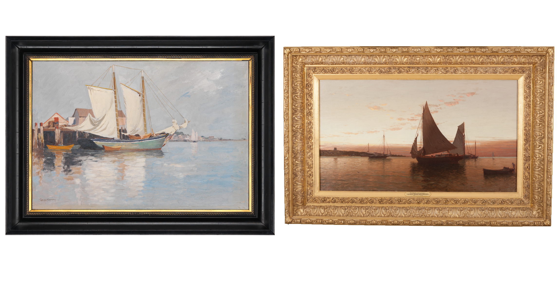
Right: Alfred Thompson Bricher, (1837–1908), Twilight Seascape, 1870-1900, oil on canvas, 27 3/4 x 41 ½ in., Museum Purchase, 2016.57.1.
In the dining room on the ground floor of the Eustis Estate hangs another harbor scene, Twilight Seascape, painted by Alfred Thompson Bricher, who was eighteen years older than George Harvey. Although both works date from the 1880s, the older man’s has a more traditional “Luminist” look featuring detailed brushwork and a hazy atmosphere. By contrast, Harvey’s painting features the brighter coloring and looser handling embraced by younger New England artists as Impressionism made its way from France across the Atlantic.
Learn more about the Bricher painting in the section below.
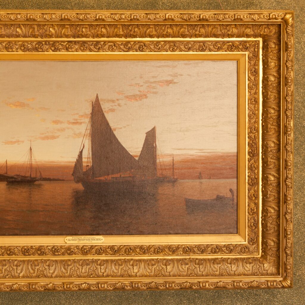
Twilight Seascape
This gorgeous luminous painting is by Alfred Thompson Bricher (1837-1908). Born in Portsmouth, New Hampshire, and raised in Newburyport, Bricher was largely self-taught. He found early success creating engravings for Louis Prang and illustrations for Harper’s Monthly. But he returned again and again to painting the sea, always capturing the quality of light and featuring distant curves, whether of the coastline, or in this case the sunlit clouds that are intersected by the sail of the boat in the foreground.
White Collars in Portraits
For artists, a white collar was useful in setting off the face—a portrait’s most important and distinctive element—from the rest of the figure. But the collars also provided a technical challenge. In both life and art, white collars are rarely just flat blocks of white color. Instead, they are surprisingly complex zones of light and shadow: the same white fabric takes on a different tone as it curves around the neck or ripples down the chest.
In the section below, compare how all of these artists have handled the white in their sitters’ clothing.
John Codman III
A detail of the white collar of John Codman III in John Singleton Copley’s portrait of him.
Woman Reading Under a Tree
Several areas of Edward Mitchell Bannister’s Woman Reading Under a Tree merit closer looking. Click the hot spots in the image for more details.
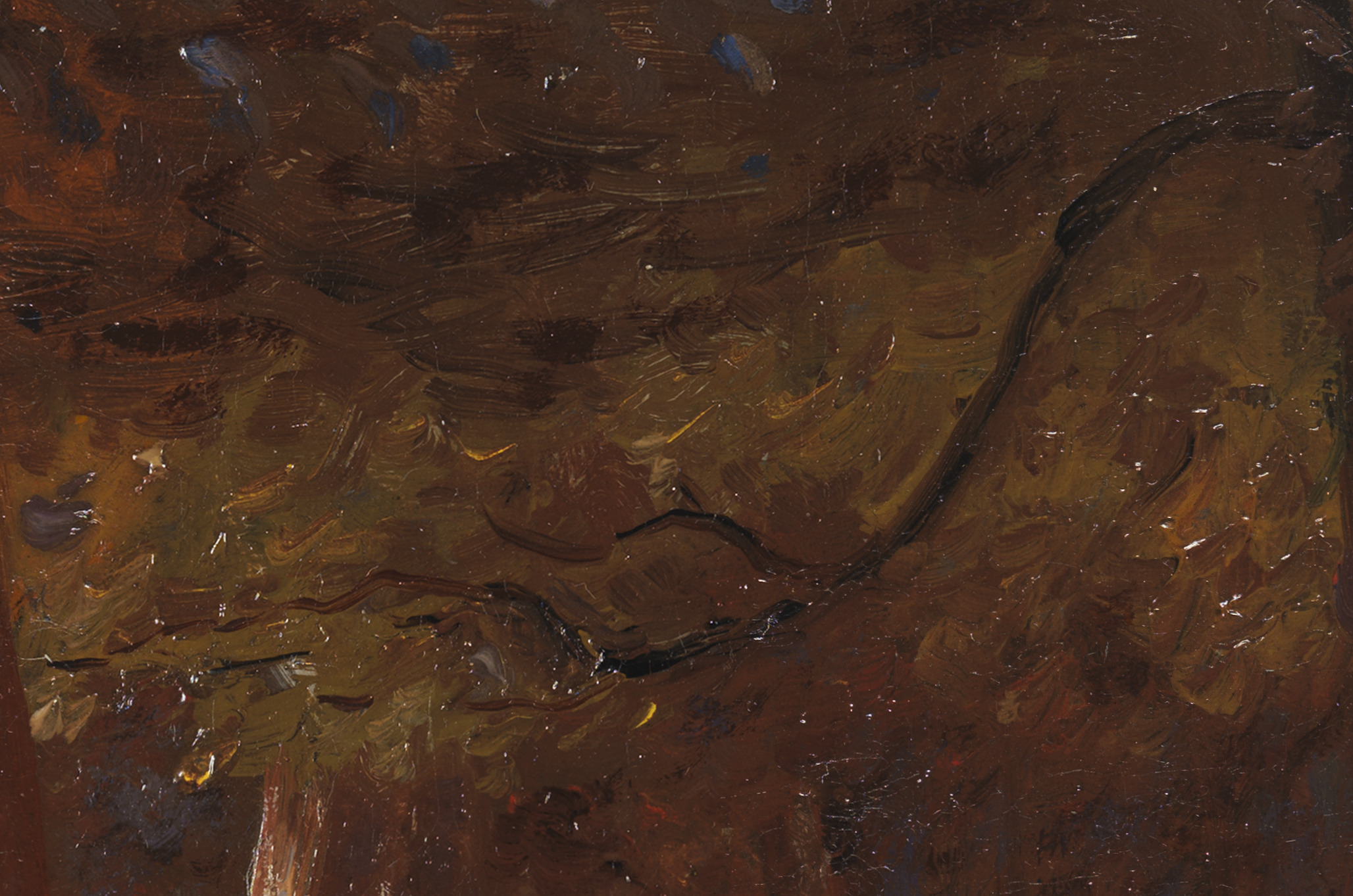
The arching branch at center right guides our eye toward the massive central tree trunk in the distance and complements the verticality of the adjacent trunks.
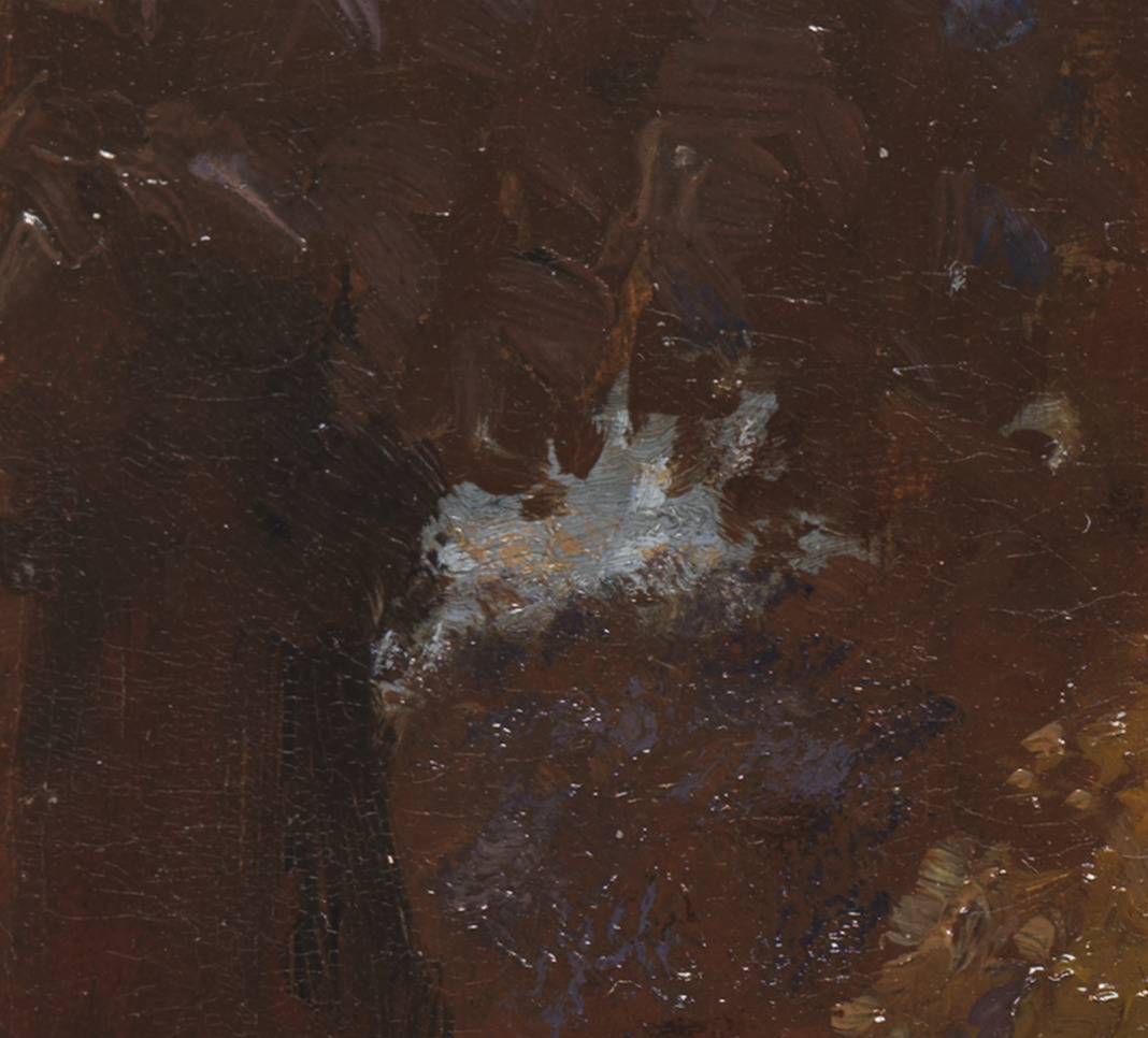
The patch of blue sky visible through the foliage at top left offers us a sense of perspective and a reminder of how clear the weather is.

Bannister masterfully contrasted brilliant sunlight on the grass with shadows in the foreground.
to learn more
Venice
Hermann Dudley Murphy
Hermann Dudley Murphy’s gift for juxtaposing strokes of color is evident in this scene of Venice. This flickering effect—influenced by his absorption of Impressionist and Post-Impressionist aesthetics that had made their way from Europe to America—is completely different from the more hard-edged, firmly drawn vision of Venice conveyed by an unknown artist in this gallery.
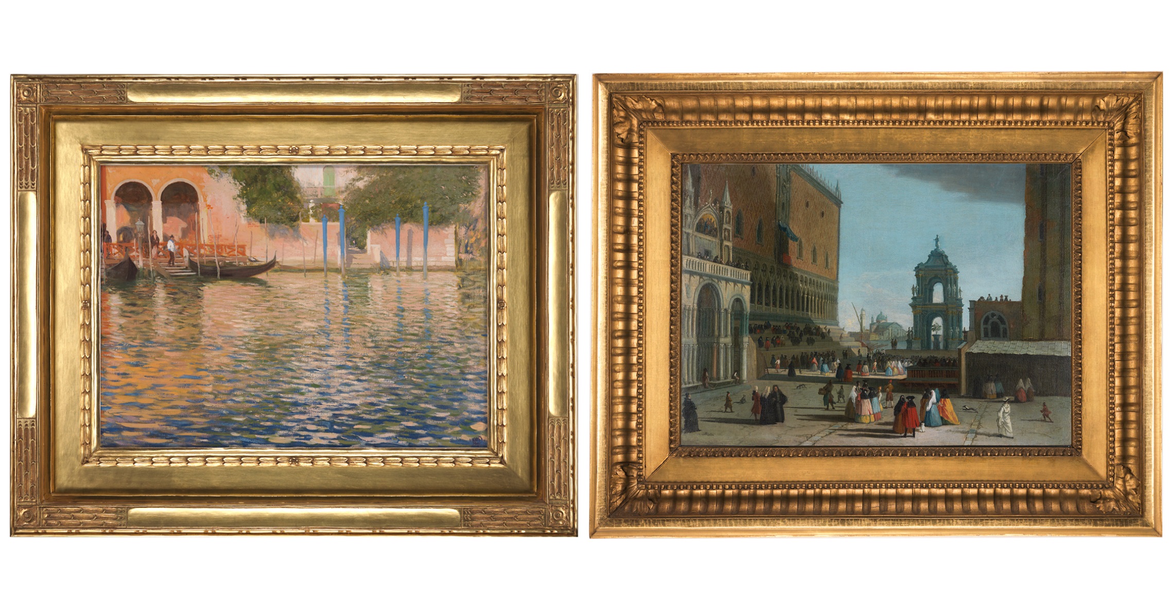
Right: Unknown artist, Piazza San Marco, Venice, 1730–90, oil on canvas, 33 x 41 in., Gift of Dorothy S. F. M. Codman, 1969.849.
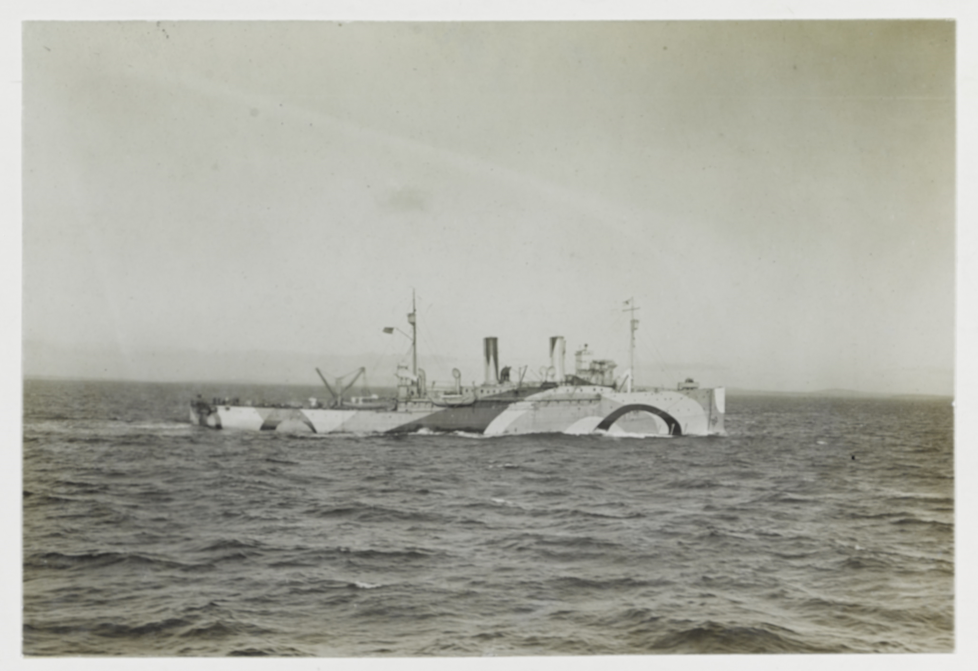
Murphy’s understanding of how colors interact was one factor in his later becoming the U.S. Shipping Board’s Chief Inspector for Camouflage during World War I. Hundreds of artists joined the American armed forces’ and merchant marine’s camouflage effort, applying their knowledge of nature and optics to the visual concealment of ships, tanks, and other objects.
Piazza San Marco, Venice
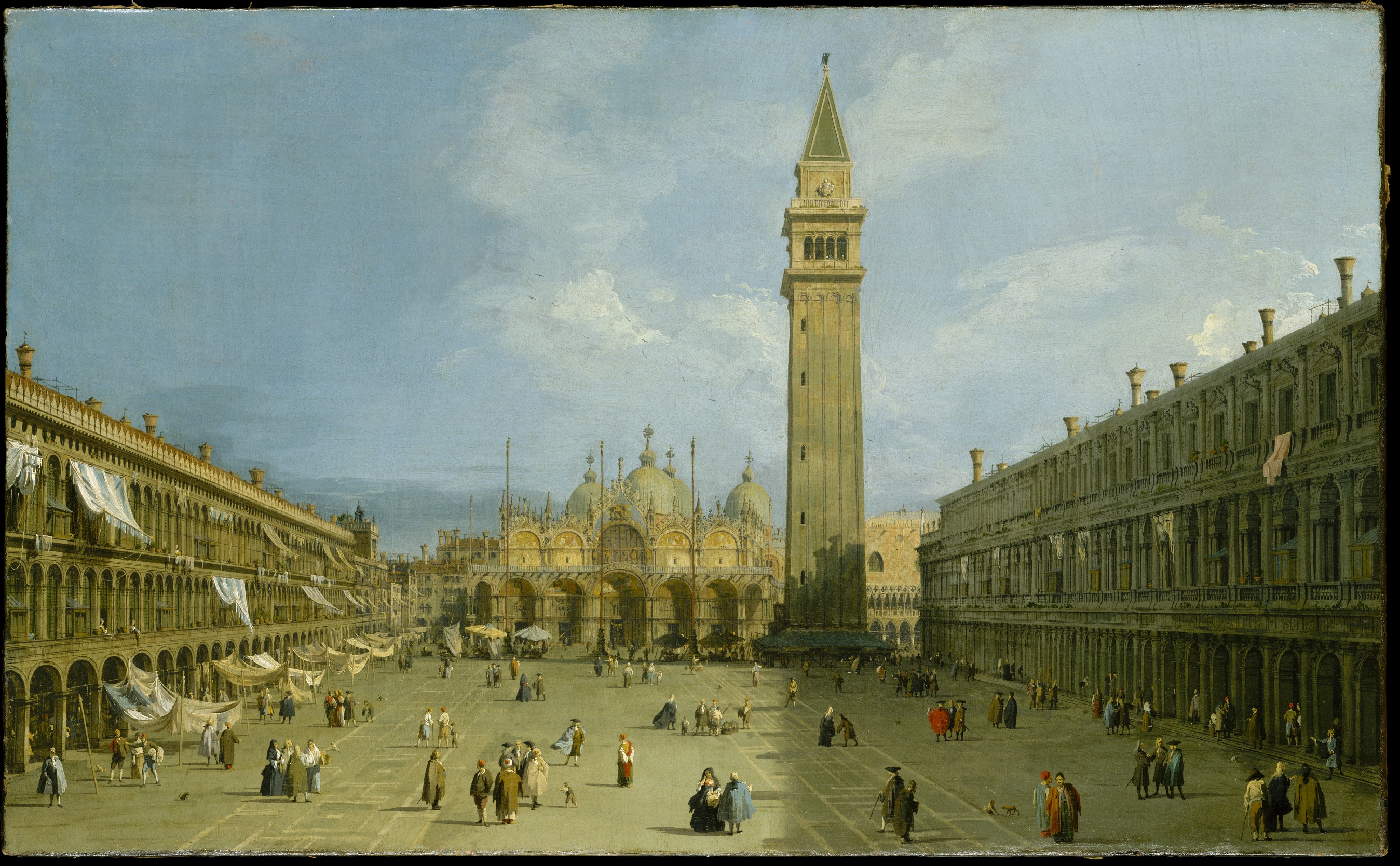
Viewers may wonder why the Codmans discounted Canaletto and then Guardi as the painter of this canvas. The answer becomes clearer when we compare it to firmly attributed works by these Venetian masters. The Canaletto illustrated here shows the full sweep of Piazza San Marco, with St. Mark’s Basilica and the Campanile at the far end. Canaletto offers the same detailed account of architecture and costumes seen in the Codmans’ painting, but also a convincing sense of “atmosphere.” Note, for example, the delicacy and variation of Canaletto’s clouds, and how his air seems to shimmer with the humidity that characterizes this port city.
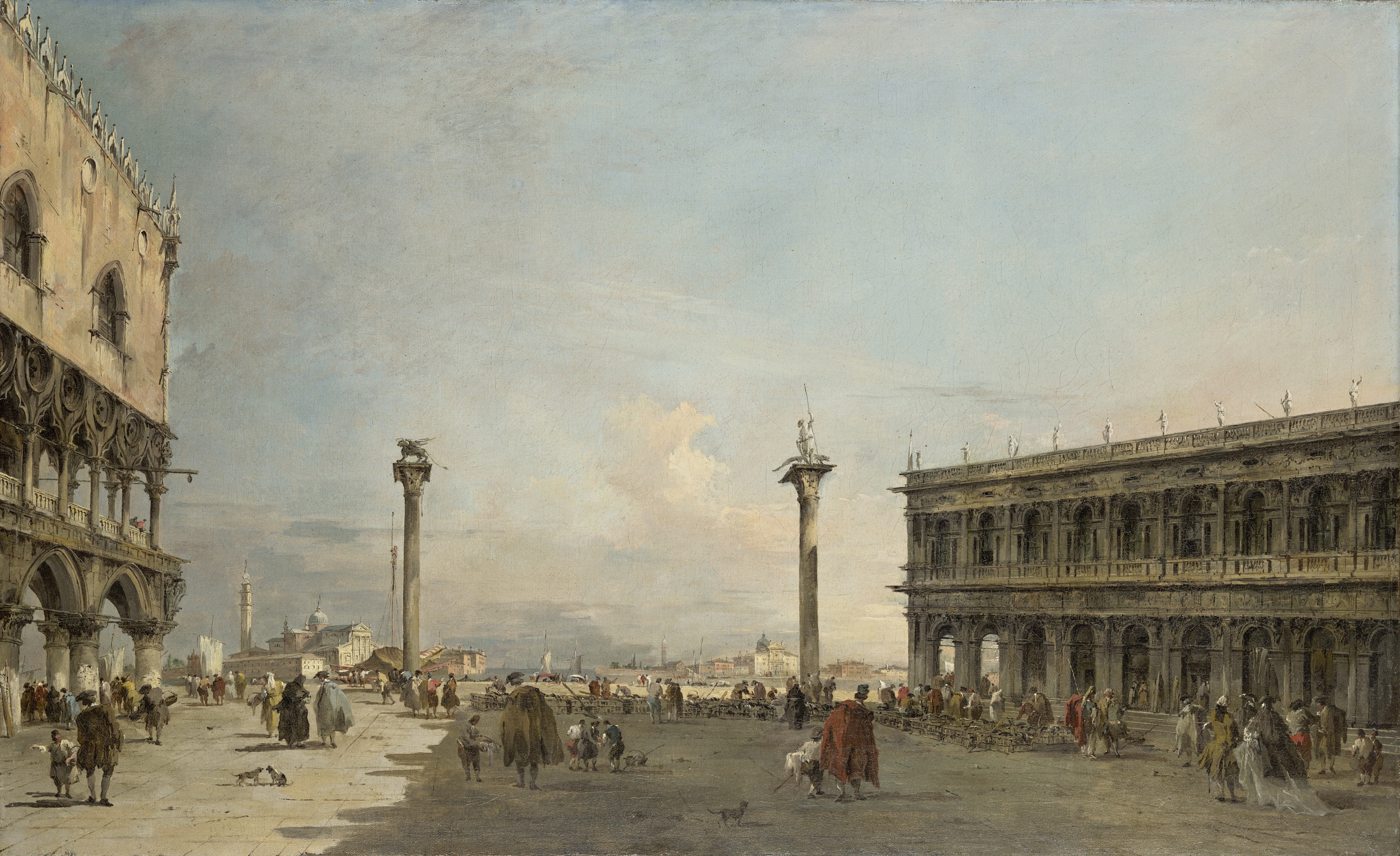
Francesco Guardi was fifteen years younger than Canaletto and won praise for his looser handling, which was more fashionable by his time. In this example depicting the Piazzetta—where the stage and bleachers appear in the Codman painting—Guardi shows us the same architecture and similar pedestrians, but his brushwork is not as meticulous. Because it is less exact, it conveys a sense of movement we might describe today as Impressionistic. The painter of the Codman painting was not interested in such dynamism, focusing instead on the pomp about to unfold.
The unattributed Codman painting’s emphasis on architecture and civic life contrasts strikingly with a much later view of Venice displayed on the ground floor of Eustis Estate. In his dreamily Impressionistic vision of a gondolier awaiting passengers, the “Boston School” painter Edmund Tarbell shifted viewers’ attention away from the city’s buildings toward its broad lagoon and the bustling maritime industries indicated by the many masts visible. Learn more about Tarbell’s painting Waiting. Morning Effect. Venice, below.
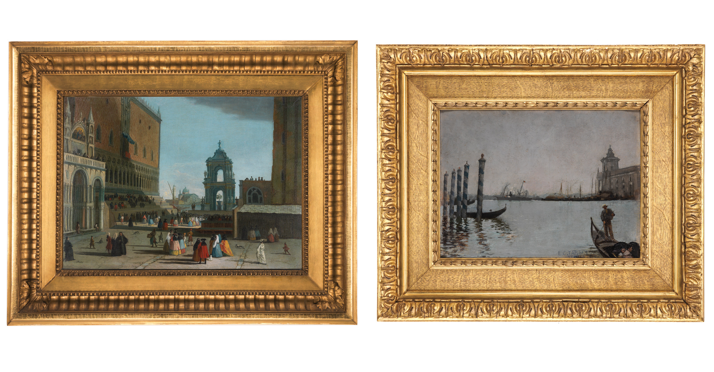
Right: Edmund Charles Tarbell (1862–1938), Waiting. Morning Effect. Venice, 1885, oil on panel, 19” x 22 ¼ in., Museum Purchase, 2019.25.1.
Woman Working in a Kitchen
This painting came to Historic New England from the estate of well-known collectors who were active in the early twentieth century. At first glance it’s a typical “genre” scene – a painting of everyday life. These were particularly popular in the nineteenth century and were made by both academically-trained and amateur artists. On close inspection it’s clear that this scene was created by a talented and highly trained painter.
Click on the hot spots in the painting to learn more about how the artist is using light and shadow, color, and perspective.
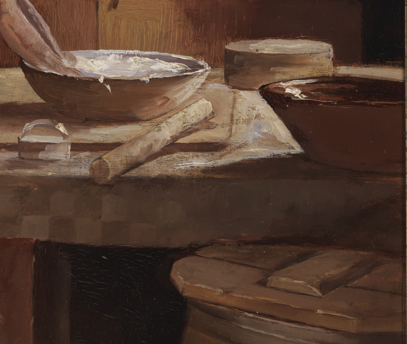
Perspective: Notice the artist’s playfulness and skill with repeating circles. In converting a group of round items into a series of varying ovals the painter has created a clear sense of the depth in the space.
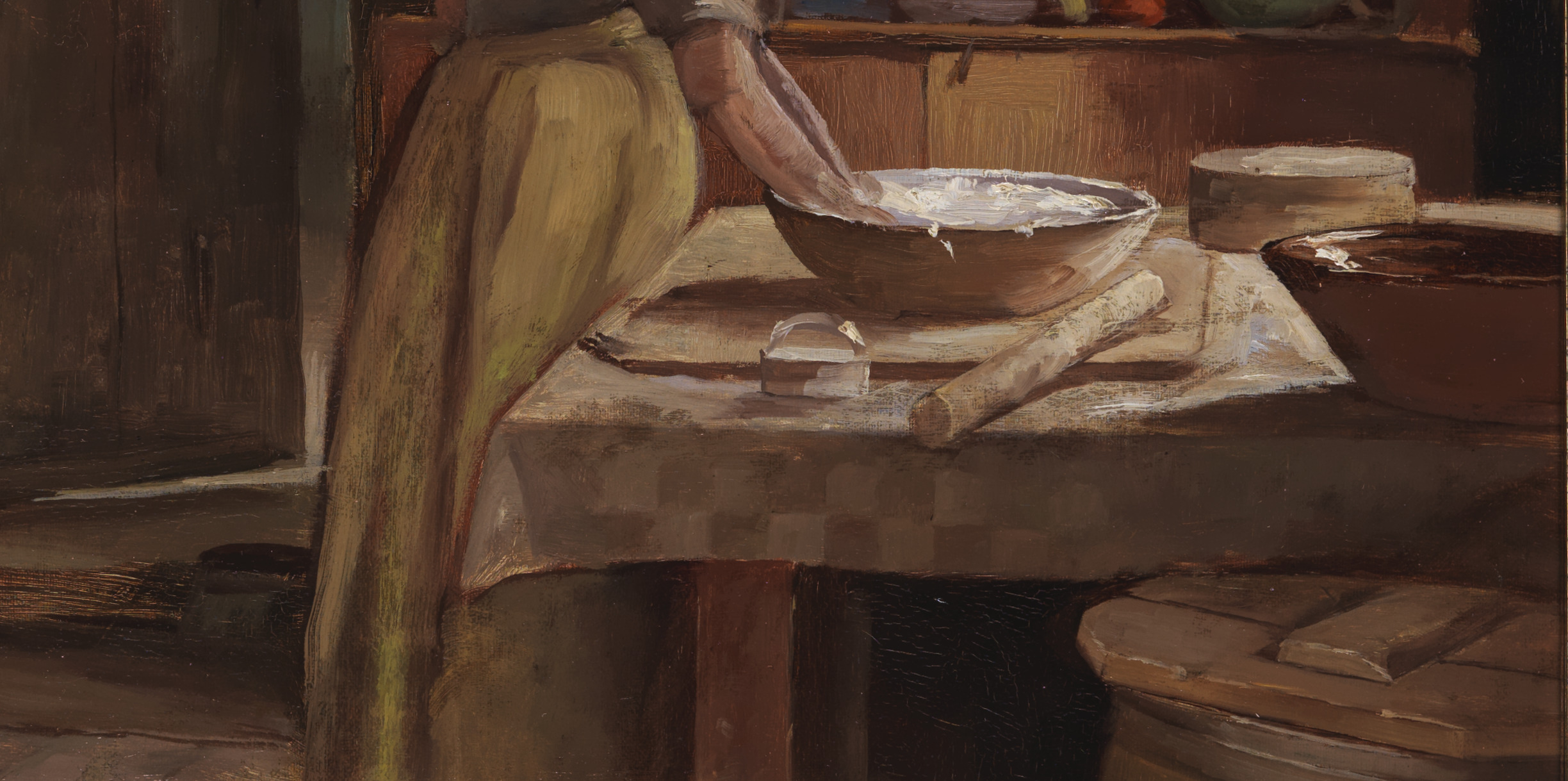
Light and shadow: This close-up view shows the painter’s skillful handling of light. Although we can’t see it, we know the table is placed before a window that provides light in the space. Notice how the contrast of light and shadow diminishes as we look from right to left. The shadow beneath the redware bowl on the table is significantly darker than the one thrown on the floor by the woman’s skirt. Notice, too, the light on the floor behind the open door. We can imagine the unseen windows in that room as well.
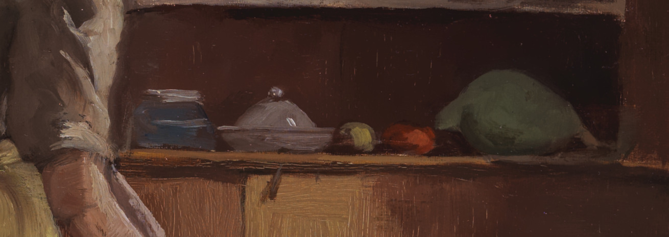
Color: By including small items that are blue, yellow, red, and green, in contrast to the overall color palette, the artist draws our eye to the cupboard behind the table.
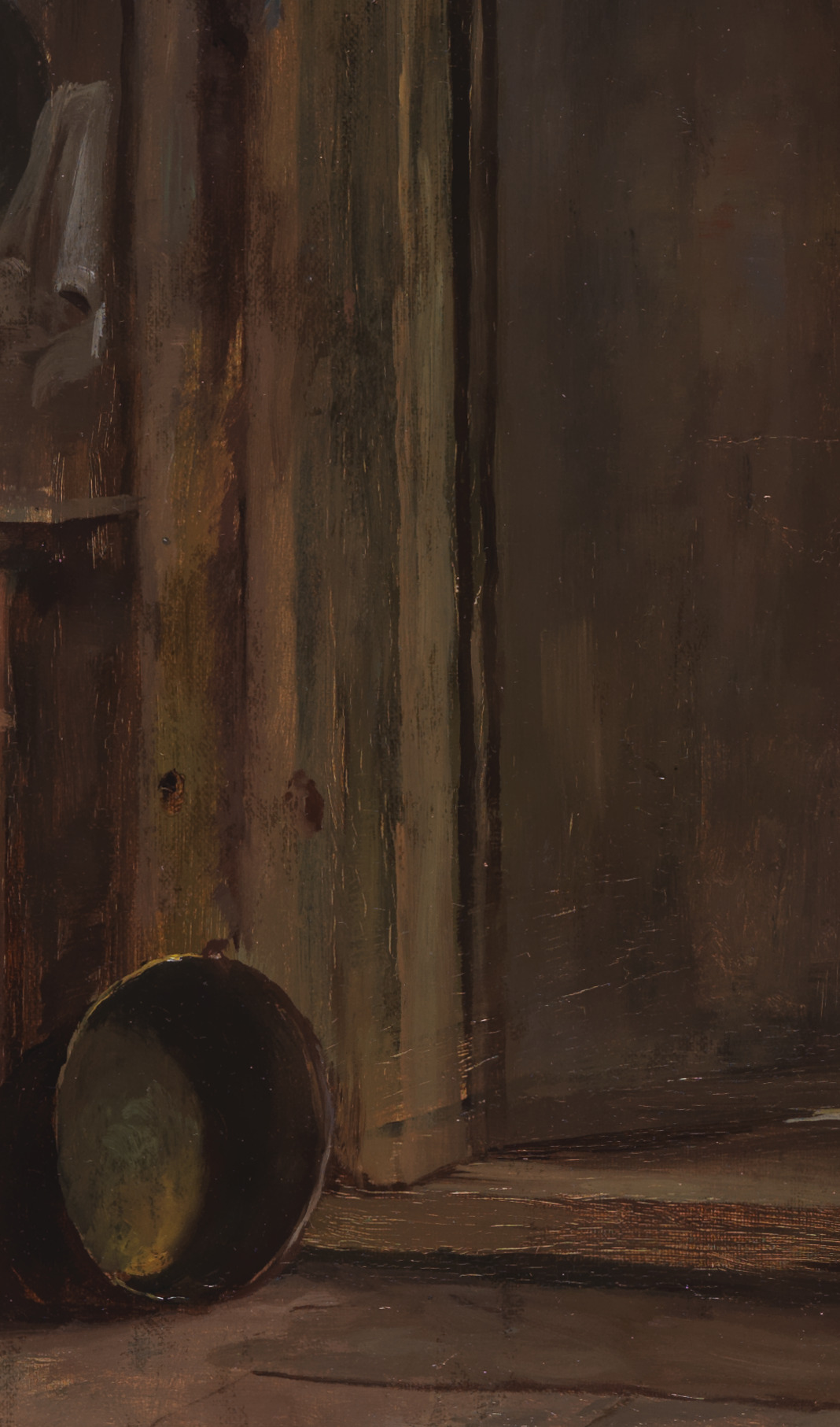
Color: Notice all of the subtle colors that have gone into what is essentially a reddish brown background. Here the use of color creates a liveliness in what could otherwise be deadened space.
to learn more
