 Eustis Estate
Woman Working in a Kitchen
Unknown Artist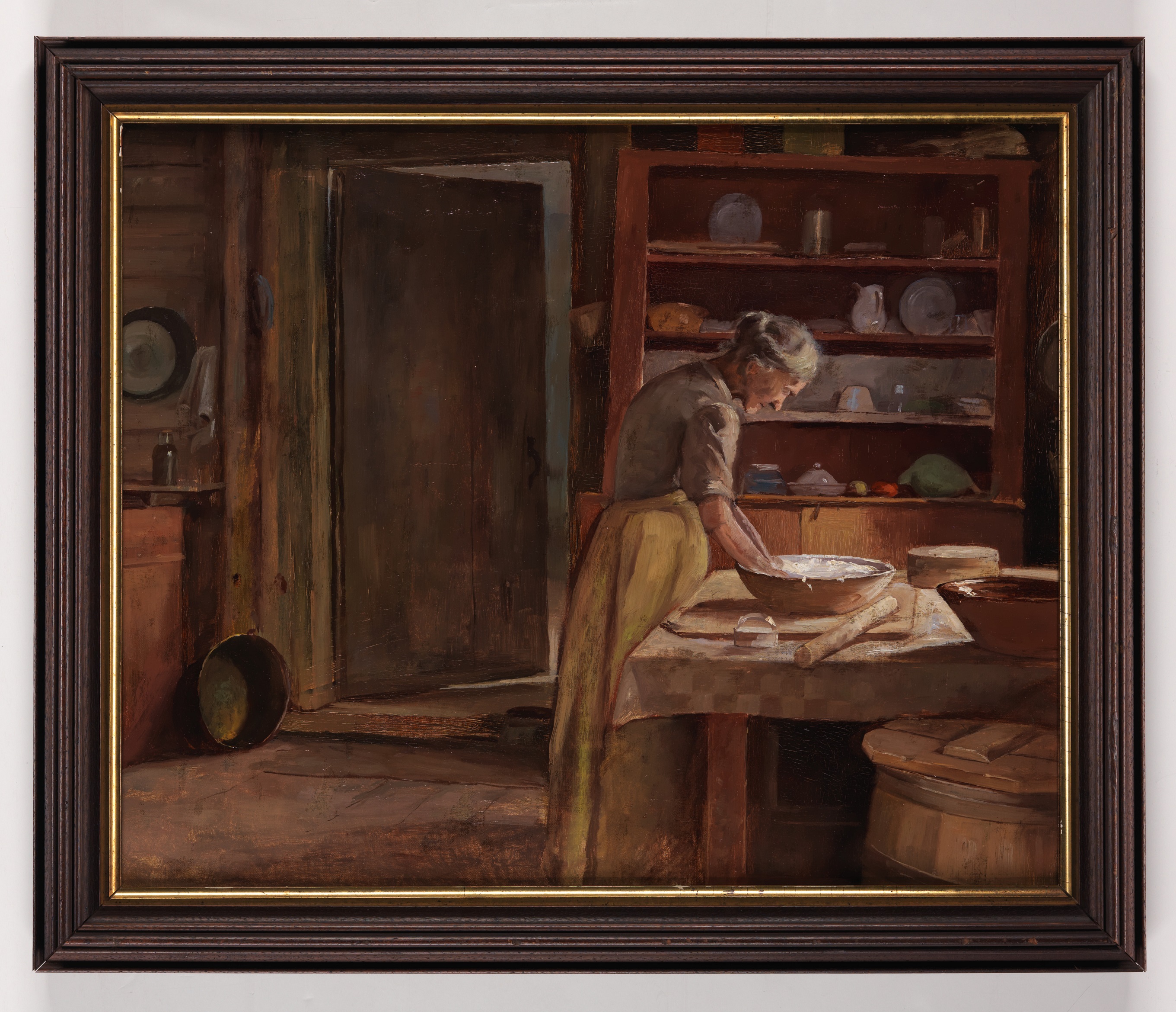
Learning to Look

Most of us first look at a painting and see the overall image. We imagine being in the place where the artist was. Has the artist captured the mood of a rainy day in the city? What was the person in this portrait like? But we can also learn something by looking more closely at what’s on the canvas. How has the way the artist applied the paint enhanced the image? How does the composition direct your eye around the scene? How do the choices this artist made relate to those made by another artist?
Woman Working in a Kitchen
This painting came to Historic New England from the estate of well-known collectors who were active in the early twentieth century. At first glance it’s a typical “genre” scene – a painting of everyday life. These were particularly popular in the nineteenth century and were made by both academically-trained and amateur artists. On close inspection it’s clear that this scene was created by a talented and highly trained painter.
Click on the hot spots in the painting to learn more about how the artist is using light and shadow, color, and perspective.
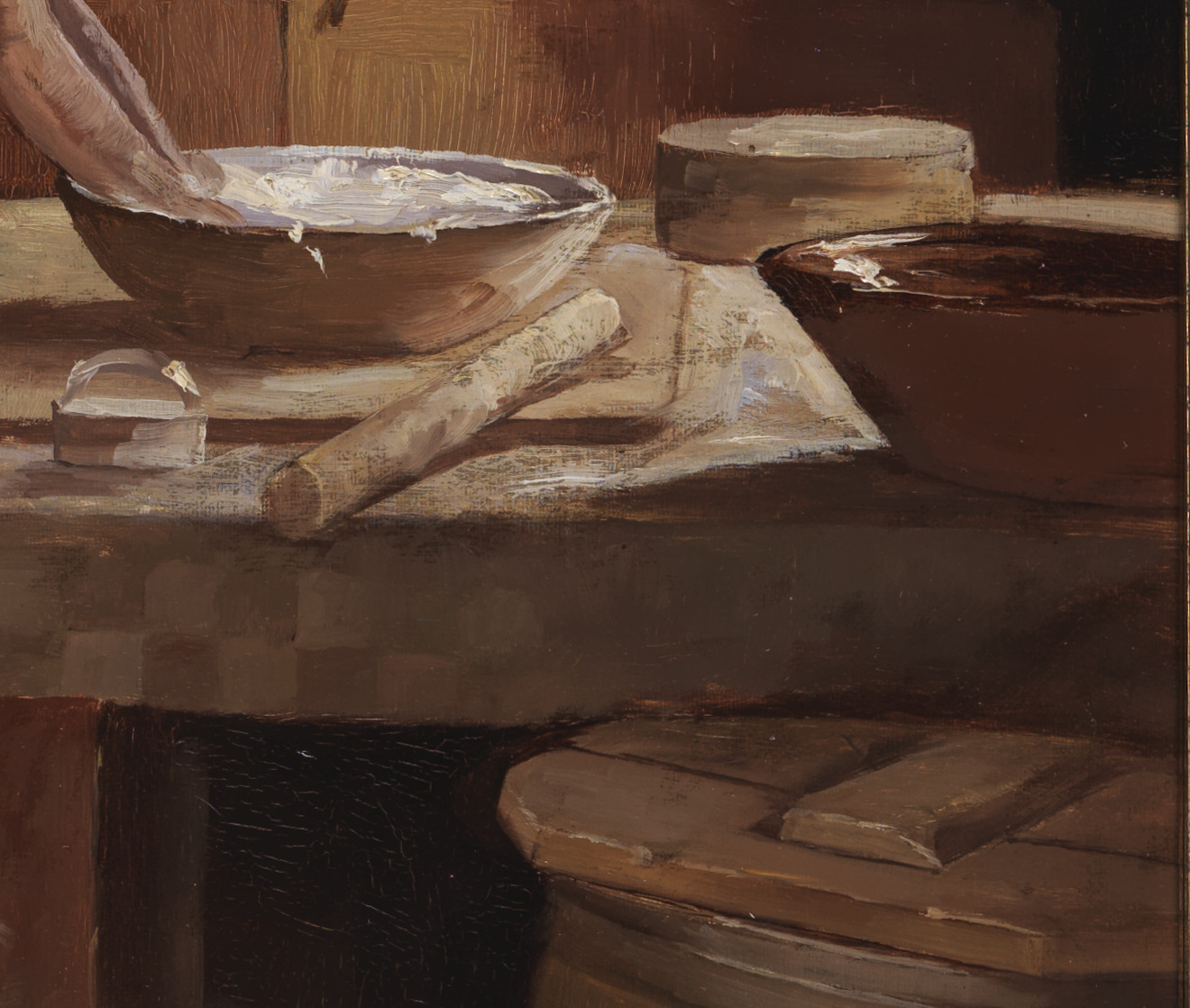
Perspective: Notice the artist’s playfulness and skill with repeating circles. In converting a group of round items into a series of varying ovals the painter has created a clear sense of the depth in the space.
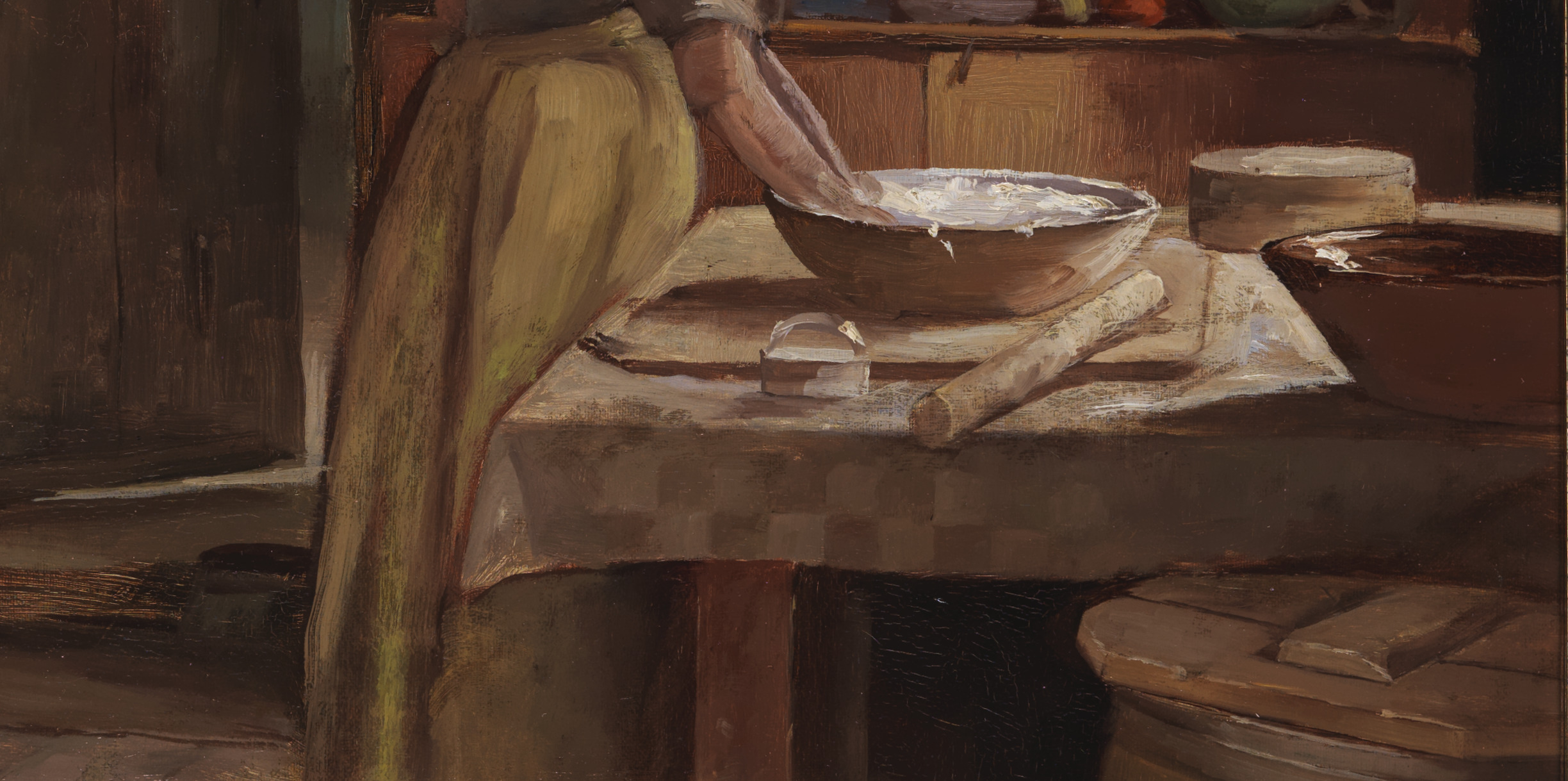
Light and shadow: This close-up view shows the painter’s skillful handling of light. Although we can’t see it, we know the table is placed before a window that provides light in the space. Notice how the contrast of light and shadow diminishes as we look from right to left. The shadow beneath the redware bowl on the table is significantly darker than the one thrown on the floor by the woman’s skirt. Notice, too, the light on the floor behind the open door. We can imagine the unseen windows in that room as well.
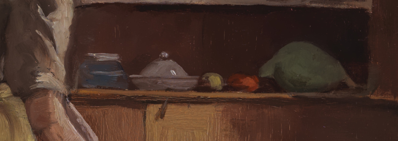
Color: By including small items that are blue, yellow, red, and green, in contrast to the overall color palette, the artist draws our eye to the cupboard behind the table.

Color: Notice all of the subtle colors that have gone into what is essentially a reddish brown background. Here the use of color creates a liveliness in what could otherwise be deadened space.
to learn more